Merchandise Project : PORTA-L
PORTA-L is a family held together by affection, chaos, and the quiet in between.
Role
Design Graphic
Industry
Educating
Duration
2018 - Present

Stage 1. Concept & Storytelling
PORTA-L began with a simple idea: turning a family story into something tangible.
Built around the complexity of family, PORTA-L explores the space between love, conflict, distance, and belonging. Rather than creating merchandise purely as a visual product, the project was developed as a medium to translate personal experiences and emotions into objects that people could wear, keep, and interpret in their own way.
The concept was shaped around the idea that family is never simply one thing. It can be warm and chaotic, intimate and distant, beautiful and painful at the same time.
Stage 2. Visual Exploration & Direction
The visual direction was developed by translating the emotional tension within the concept into a distinctive visual language.
Explored through typography, symbols, compositions, and contrasting visual elements, the design process focused on finding a balance between intimacy and disruption. Each element was considered as part of a larger narrative, allowing the merchandise to feel less like conventional apparel and more like a fragment of a story.
The creative direction leaned into rawness, imperfection, and surreal visual references to reflect the unpredictable nature of family relationships.
Stage 3. Design Execution
Graphic Development: Developed a series of graphic compositions that reinterpret themes of family, attachment, conflict, and identity through experimental typography and imagery.
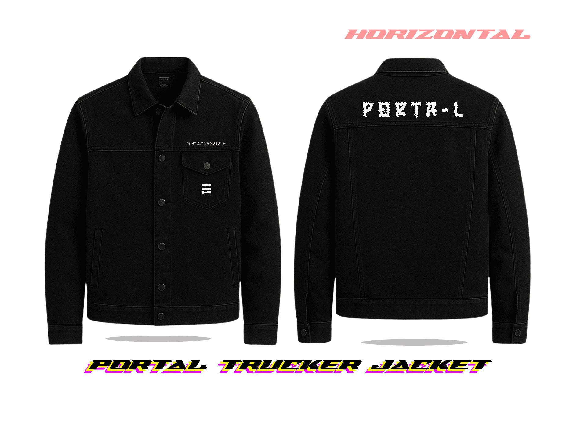
Merchandise Design: Translated the visual identity into wearable pieces, ensuring each design could function independently while remaining connected to the overall PORTA-L narrative.
Art Direction: Established a consistent visual atmosphere across the collection through composition, texture, typography, and visual symbolism.
Mockup & Application: Applied the developed artwork to merchandise mockups to explore scale, placement, and how the visual identity translates from screen to physical form.

Stage 4. Refinement & Visual Cohesion
The designs went through several rounds of refinement to ensure that each piece maintained its own character while still belonging to the same universe.
Rather than aiming for perfect symmetry or conventional aesthetics, the process embraced visual tension and controlled imperfection. Elements were continuously adjusted in scale, placement, typography, and composition to create a collection that feels cohesive without becoming repetitive.
The final direction was built around the idea that every piece could tell a different part of the same story.
Stage 5. Final Collection & Presentation
The final PORTA-L collection brings together the project's narrative, visual identity, and merchandise applications into a cohesive creative direction.
Every piece represents a different fragment of the story, allowing the collection to exist somewhere between fashion, personal archive, and visual storytelling.
PORTA-L is not designed to explain the story completely.
It is designed to leave enough space for people to find their own meaning within it.

Reflections
This project was a testament to the importance of thorough user research and iterative design in creating solutions that truly meet user needs. It honed my skills in collaboration, problem-solving, and effective communication, setting a solid foundation for my future endeavors in UX/UI design.

